Click here to go to 'Figures/Overheads' section.
Click
here to return to 300b course outline.
Click
here to return to 505 course outline.
Satellite
derived remote sensed images are representations
of the variation in intensity of electromagnetic
energy reflected from the Earth's surface. The specific image produced
is determined by the wavelength of the electromagnetic energy that is being
sensed, and the physical properties of the matter that reflects the energy.
Aerial photographs use only the visible portion of the electromagnetic
spectrum (5 x 10^-7 metres = .5 microns), whereas Landsat
TM and SPOT images record the Earth's reflectivity at seven different
wavelengths in the visible and infrared
range, and radar images record the reflectivity of wavelengths in the non-visible
range of 1 to 10 cm (microwaves).
Landsat
and SPOT are passive remote data acquisition
systems in as much as they rely on sunlight reflected
off the Earth to image the Earth's surface. Radar systems are active
systems that send their own microwave signals down to the Earth. The longer
wavelength of radar is better suited for penetration
of clouds, dust or smoke, and data can also be collected in darkness.
Other
remote sensed images can also be generated by interpolating
point data collected by magnetometer or gravimeter surveys.
Web courses in remote sensing can be accessed at:
http://www.ccrs.nrcan.gc.ca/ccrs/eduref/tutorial/indexe.html
and http://rst.gsfc.nasa.gov/starthere.html
Humans
perceive colour by the relative intensity of the stimuli of the red, green,
and blue cones of the eye. Any colour can be produced by adding together
in various combinations the radiation emanating from the red, green and
blue portions of the visible part of the electromagnetic spectrum (see
APPENDIX
A). For example, the colour yellow would be generated by a combination
of 50% pure red, 50% pure green and 0% blue, the colour orange by the combination
of 75% pure red and 25% pure green, and the colour olive by the combination
50% red at 50% intensity (dark red) and 50% green at 50% intensity (dark
green). In this respect, olive can be considered as 50% yellow mixed with
50% black.
If
only the red cone of the eye - or the red phosphor of a video monitor -
is being excited, the shade of red seen would reflect the relative proportion
of red added to black, where the relative intensity (brightness) of the
red radiation is usually measured on an 8-bit scale of 0 (black) to 255
(pure red). Where all three visible wavelengths are of equal value and
are at maximum intensity (255), the eye perceives the combination as the
colour white, whereas at less than maximum intensity the eye sees some
shade of grey, ranging down to black at an intensity value of 0.
In
the case of a computer generated image, the brightness values of a single
image, which would appear grey if sent to all three RGB guns of the video
monitor (TV screen), can be converted to colour values through the use
of a palette (also known as a Colour Look Up Table), where each brightness
value ranging from 0 to 255 is assigned a colour from a range of 256 colours
representing some arbitrary combination of the various shades of red, green
and blue. A single image composed of readings of the red visible band could
be assigned a red scale palette, allowing the variation in brightness of
the image to be displayed as shades of red varying from pure red (255,0,0)
to dark red (e.g. 127,0,0) to black (0,0,0). Such images are said to be
'pseudocoloured'.
When
three separate red, green, and blue images (TM bands 3, 2, 1, respectively)
are sent to the red, green and blue guns of the display device at the same
time, a colour composite image will be displayed that will replicate the
image as seen directly by the human eye. However, if an infrared image
band is substituted for one of the visible bands, the resulting 'false
colour' image will no longer resemble the image seen by the naked eye;
in this case, we fake seeing the infrared wavelength by substituting it
for one of the visible wavelengths..
The image display is also influenced by the size of the cells making up the image. In the case of TM images, the size of the cell (resolution) is 30 metres, whereas for SPOT images it is 10 metres. RADARSAT images have variable resolution but the maximum resolution is 8 metres.
No matter what kind of electromagnetic data is being imaged, the image produced is merely a raster representation of a matrix of numerical values, where the attribute of each cell in the matrix represents the average intensity of reflection of the electromagnetic radiation at the location represented by the cell. The range and frequency of reflectance values can be examined in the form of a histogram in most GIS software packages. (In IDRISI, the histogram for an image is displayed by selecting HISTO in the DISPLAY menu.)
The
display characteristics of the image can be improved by using a modification
technique called CONTRAST STRETCH.
For example, if an image is composed of reflectance values of 10 to 19
(a range of only 10 values equal to 4% of the total range of 255 values
of the grey scale), the image will appear virtually black because we are
unable to discriminate between the different degrees of blackness in this
part of the grey scale (the contrast ratio
- brightest/darkest is low). However if the image is 'stretched'
so that the value of 10 is given a value of 0 (black) and the value 19
a value of 255 (white), the intermediate values between 10 and 19 will
be spread through the full range of grey, and because of the dramatic increase
in the contrast ratio, the degree of variation will now be more easily
visible to the human eye.
The
image can also be 'density sliced', which means that the total range of
values from 0 to 255 can be displayed as, for example, only 16 colours,
each representing a range of 16 values, or 8 ranges of 32 values each.
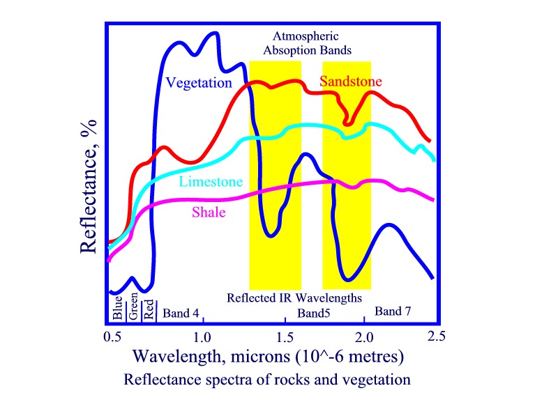
The Landsat TM image bands used in this exercise include bands 3, 4 and 5. Band 3 (0.63-0.69 microns) is the visible Red band and matches a chlorophyll absorption band that is important for discriminating vegetation types, i.e. low reflectance values for vegetation and higher values for rocks. Band 4 (0.76-0.9 microns; reflected infrared) is useful for mapping total biomass (trees, bushes, grass) content and shorelines, i.e. high reflectance from vegetation, and total absorption of infrared wavelengths by water. Band 5 (1.55-1.75 microns; reflected infrared) indicates moisture content between vegetation types and between vegetation and rocks/dry soil, the latter having a higher reflectance. Band 7 will detect minerals with a high bonded OH content, such as clays and serpentine.(see Sabins, Chapter 11, Mineral Exploration)
In
the RGB COLOUR MODEL digital images can be
displayed in one of three ways:
1)
as a greyscale image, with the same pixel
value being sent to all three colour guns of the display device (the monitor).
2)
as a pseudocoloured image, where the colour
of each cell corresponds to that of a numbered tile in a colour palette
or Look Up Table (LUT).
3)
as a colour composite of three bands of data,
where the intensity of the value of the same cell in three different images
is mapped separately to the red, green, and blue guns of the display device.
See also: http://216.15.110.77/manifold/manuals/5_userman/mfd50RGB_Images_and_Channels.htm
IDRISI
COMPOSIT Notes (modified)
1.
COMPOSIT is designed to produce color composite images to be displayed
with the IDRISI Color Composite 256 palette. To create the composite image
from three input bands, each of the three bands is stretched to 6 levels
(6 * 6 * 6 = 216 composite levels). The composite image consists of color
indices where each index = blue + (green * 6) + (red * 36) assuming a range
from 0-5 (i.e. steps of 20% change in intensity) on each of the three bands.
For example a pixel with RGB values of level 1 red (20%; 50/250), level
5 green (100%; 250/250), level 3 blue (60%; 150/250) would have an index
of blue level 3 + (green level 5 * 6) + (red level 1 * 36) = 69. The Color
Composite 256 palette colors correspond to the mix of blue, green and red
in the stretched images.
2.
The Color Composite 256 palette contains composite colors from color index
0 through color index 215 (the maximum value in an IDRISI composite image).
The first six index values range from black (index 0) to pure blue ( index
5). The second set of index values ranges from a mixture of green at 20%
saturation and blue at 0% saturation ( index 6) to green at 20% saturation
and blue at maximum saturation (index 11). The next range beginning at
index 12 starts with green at 40% saturation and no blue to mixtures of
green at 40% saturation and pure blue. And so on, such that
at index 36 red is introduced at 20% saturation, and index 37 would be
red at 20% and blue at 20%, and index 43 would be red at 20%, green at
20%, and blue at 20%! Colors 216-255 include colors that may be useful
for displaying features, such as roads, that are rasterized onto the color
composite image. (These notes are easier to understand if they are
read while examining the composite palette in IDRISI Palette Workshop!!)
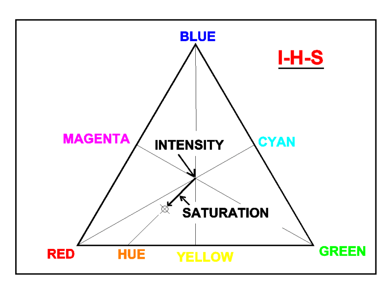
4) A fourth method of displaying images uses the Intensity - Hue - Saturation
(IHS) MODEL, where three-colour RGB mixtures are described in terms of
Hue
as a two-colour mixture (dominant wavelength) of Red and Green or Green
and Blue or Blue and Red; Saturation, the
degree of mixing of Hue with white light (pure colours are highly saturated,
and intermediate values of saturation represent pastel shades); and Intensity,
the proportion of white light relative to black. The RGB and HIS models
are simply different representations of the same colour space and consequently
RGB images can be transformed into HIS images and vice versa. It is easier
to think of colour in terms of IHS than in terms of RGB.
For example, you will note in the above diagram that adding pure green and blue to pure red in the proportions 25%, 25%, 50%, respectively, is the same as adding white (represented by the centre of the triangle) to red in the proportions 75% to 25%, respectively (where 25% red + (25% red + 25% green + 25% blue) = 25% red + 75% white), the resulting colour in both cases being a pastel pink. It is easier to imagine pastel orange as a mixture of red and yellow made pastel by adding white than it is to think of it as a mixture of red, green, and blue. Saturated colours can also be made more or less brighter by changing the intensity, that is, by adding/subtracting black.
See also: http://216.15.110.77/manifold/manuals/5_userman/mfd50Colors_as_Hue_Saturation_and_Bri.htm
The IHS transformation is commonly used to merge several bands of remote sensed data, e.g. high resolution SPOT panchromatic images with low resolution Landsat images, or, Landsat and Radarsat images, or, Radarsat with magnetic or gravity data.
IDRISI COLSPACE notes:
1. For more information on the conversion between RGB and HLS see Foley, J.D., A. van Dam, S.K. Feiner, J.F. Hughes, (1990) Computer Graphics: Principles and Practice (New York: Addison-Wesley), Chapter 13.
2. The HLS double-hexcone model used puts red at the 0 degree point (as is most common) rather than the older Tektronix convention of blue.
3. In this implementation, all images remain in byte binary format. Thus for hue, 0 represents 0 degrees and 255 represents 360. Likewise lightness and saturation both range from 0-255.
4. To merge SPOT panchromatic
and multispectral data, use the original multispectral images in COLSPACE,
with RGB to HLS option, to create Hue, Lightness and Saturation images.
Use EXPAND with an expansion factor of 2 in X and Y to change the resolution
of the Hue and Saturation images to match that of the panchromatic image.
Run COLSPACE again, with HLS to RGB option, giving the Hue and Saturation
images you have expanded when asked for Hue and Saturation, and giving
the panchromatic band when asked for Lightness. Use COMPOSIT to composit
the resulting Red, Green and
Blue bands. Use the Color
Composite palette when viewing the result.
In the current exercise we will examine the characteristics of:
Landsat
TM bands 3 (visible red), 4 (photo infrared), and 5 (mid reflected
infrared) (Scnbnd3.img, etc)
Radarsat
for the month of June (Scn0406.img)
Magnetic
vertical field gradient (Scnvg.img)
Each
image is 1700 columns by 1385
rows, and the cell resolution is 30 metres.
The
object of this exercise is to integrate the radar, Landsat TM and magnetic
data into a colour composite 'fused' image.
PROCEDURE
The following exercise uses IDRISI as the raster Geographic Information System and Image Processing software; see:
The sample material for the Sudbury region was purchased from Radarsat International,
http://www.rsi.ca go to Resources and then Education or Geology
Files
supplied RADARSAT:
PCI .pix files
0406raw.pix
RADARSAT - June 04, 1996
0406lee.pix
RADARSAT - June 04 Lee filtered
1104raw.pix
RADARSAT - April 11, 1996
1104lee.pix
RADARSAT - April 11, 1996 Lee filtered
all1024.pix
RADARSAT - April 11 and June 04, 1996, Landsat TM June, and aeromagnetic
data (1024x1024)
Magdata.pix
aeromagnetic data (2 channels)
Rdrtmamg.pix
RADARSAT - April 11 and June 04, 1996, Landsat TM June and aeromagnetic
data.
IDRISI files:
Scnbnd3.img/.doc
Landsat TM Band 3
Scnbnd4.img/.doc
Landsat TM Band 4
Scnbnd5.img/.doc
Landsat TM Band 5
Scnmag.img/.doc
Total Magnetic field
Scn0406.img/.doc
RADARSAT - June 4 1996
Scn1104.img/.doc
RADARSAT - April 11 1996
Scnvg.img/.doc
Vertical field gradient
NOTE: the coordinate positions shown by the PCI pix files are incorrect by kilometres, and the magnetic images are incorrectly registered in both the PCI and IDRISI data sets. The descriptions of the files on the CDROM provided by RADARSAT says that files Rdrtmamg.pix and all1024.pix are 7 channel files of RADASAT April 11 and June 04, 1996, Landsat TM June bands 3, 4, and 5, and 1024x1024 aeromagnetic data. These PCI images provides coordinate locations as lat-longs and UTMs. The UTM location of the circular island called Galliard Island in east-southcentral Ramsey Lake, Sudbury, is approximately 498550 E, 5153392 N, whereas map 'Sudbury 41-I' (1:250000) shows this location (to within 125 metres) at 504350 E, 5146500 N. The PCI location is therefore off by more than 5 km East and North, whereas the south end of Wanpaitei Lake is off by 13 km. The Rdrtmamg.pix and all1024.pix data sets show the southern high intensity magnetic stripe on the vertical magnetic channel passing through the northern part of Ramsey Lake and the northern high intensity stripe as passing through Whitewater Lake to the south of Whitson Lake. However, in the Radarsat Geology Handbook the two magnetic stripes bracket these two lakes, and it would appear that the PCI magnetic image is translated and rotated clockwise out of position relative to the image in the Handbook. As geologists we also know that the southern magnetic strip marks the norite unit of the Sudbury Irruptive, as indicated on the geological map of Sudbury, showing the impossibility of its location as shown on the PCI and the other images. Since there are no control points for the magnetic image there is no easy way of georeferencing the mag data to the radarsat/Tm data. The claim by Radarsat (p. 8-12, RadarSat Training Manual) that "Strong correlations can be seen between the topographic details provided by RADARSAT data and the patterns and details supplied by the aeromagnetic data." should therefore be treated with due scepticism. (CCRS kindly provided the quote: "The georeferencing information included in the original files is definitely wrong and cannot be used as is.")
Copy all the files in //public/Es300B/radar to a folder called 'yourintialsrsat' in your area in //Earthnt/users.
Load IDRISI and set the ENVIRONMENT to //Earthnt/users/yourname/'yourintials'rsat.
Note: remember that all raster image files in IDRIS have the extension .img. When entering the name of an image file it is not usual to give the extension. If you do not understand this, 'ask'!
A) Producing an image histogram
Display
the radar image Scn0406.img with the grey scale palette. The image is almost
black.
In
the Composer menu selection box click Properties
and then click Image Histogram, OR, in the
Display menu click Histo, enter Scn0406
as the input file name, and then click OK.
Examine the histogram. Can you now explain why the image is so dark?
Discuss your explanation of the histogram image with the instructor
B) Producing a stretched image
In
the Display menu, click STRETCH, and enter
Scn0406 as the input file, and 0406sts as the name of the output file.
Click the 'Linear with saturation' button,
set the saturation to 2.5% (rather than the
default 5%), and then click OK.
Display
the image 0406sts. Click Properties
in COMPOSER, then click the Image Histogram
button.
Repeat,
but this time give the output name as 0406hist,
click the Histogram equalization button,
and OK.
Display
and compare both images.
Examine
the histograms for these images.
Create
a stretched image for Scnband3.img,
Scnband4.img, and Scnband5.img, naming them (in the image output
box) bnd3sts.img, bnd4sts.img,
bnd5sts.img, respectively (bnd3sts=band3stretchedsaturated).
C) Producing a density sliced image.
Display image bnd5sts.img with the IDRISI256 palette. It should be mostly green with some shades of red. Now redisplay the image using the IDRISI16 palette, and with the 'Autoscale image for display' button selected. The image that will be displayed will be a 'density sliced' image, with the full range of colours from 0 to 255 reduced to a range of 15 colours. Examine the IDRISI16 palette to understand how this is accomplished. Note how the mine tailings show up in black to blue colours.
D) To create a colour composite TM image.
The Red band (band 3) and the infrared band 5 are most likely to be reflected by rocks than vegetation, whereas band 4 will be more strongly reflected by vegetation relative to rocks. Band 5 will nevertheless also provide a fairly strong vegetation reflectance (Sabins, 1997, Remote Sensing, Fig 3-1, Reflectance Spectra of rocks and vegetation .) If band 5 is sent to the red gun, band 3 to the blue gun, and band 4 to the green gun, vegetation will therefore appear in shades of green -red (yellowish) whereas sandstones should show in shades of salmon-pink. On the other hand, if band 5 is sent to the blue gun and band 3 to the red gun, vegetation will appear green-blue, and sandstone indigo blue.
Band3/blue Band4/green Band5/red
Composite colour
Rocks
x
x
xx pinks
Vegetation
-
xx
x yellow-greens
Band3/red Band4/green Band5/blue
Composite colour
Rocks
x
x
xx blues
Vegetation
-
xx
x greeny-blues
Create
a colour composite image for the stretched TM images - in the Display menu
click COMPOSIT, enter the 'Stretched' TM image names (bnd3sts for blue,
bnd4sts for green and bnd5sts for red), and an output name of c3s4s5sl.
Click the Simple Linear (NOT the Linear with
saturation) button, and then OK. Display the composite image c3s4s5sl using
the 'Colour Composite' palette.
Zoom
(use the rectangle tool) the image from column 1350, row 1000 to column
1700, row 600.
Use
the Query tool to determine the values of the various dominant colours.
Then open the Composite colour palette (DISPLAY -> Colour palette -> File
-> Open -> Permanent Library -> COMPOSIT) and display the colour corresponding
to one of the values determined in the Query operation. Analyse the relative
proportion of red, green and blue in the colour displayed, and translate
into relative proportions of the 3, 4, and 5 TM bands. Do the same for
some of the other prominent colours in the composite image.
Repeat
the operation to make an image c5s4s3sl.img.
Compare
the two images; note the patches of intense red in c5s4s3sl.img and of
intense blue in c3s4s5sl.img for the relatively recently formed smelter
waste products and tailings ponds, and the muddy edges of some lakes. This
indicates very strong reflectance of only band 3 (a high rock to vegetation
index), and very little input from band 4 (no vegetation) and band 5 (no
vegetation and high water contribution).
E) To create colour composite TM/RADAR and TM/Magnetic images.
Create
an image crs4s5sl.img composed of radar band 0406st as blue, bnd4sts as
green and bnd5sts as red. Zoom (use the rectangle tool) the images from
column 1350, row 1000 to column 1700, row 600.
Create
an image crs4s3sl composed of radar band 0406st as blue, bnd4sts as green
and bnd3sts as red. Zoom (use the rectangle tool) the images from column
1350, row 1000 to column 1700, row 600, and compare this image with crs4s5sl.
Image crs4s5sl has more yellow colour because of the strong vegetation
reflectance of band 4 sent to the green gun is mixed with the vegetation
reflectance in band 5 sent to the red gun (Red + Green = yellow!!). In
contrast band 3 has very low reflectance values for vegetation, and the
vegetation signal is therefore dominated by band 4 sent to the green gun.
(Compare the histograms for bnd3sts and bnd5sts).
Create an image cvg4s5l.img as a magnetic overlay on the TM data, with bnd4sts as green, bnd5sts as red, and Scnvg.img as blue.
F) Carrying out an HIS transformation (fusion) on the radar, TM5, and vertical gradient data sets.
Fetch the module COLSPACE via Analysis -> Image Processing -> Transformation -> COLSPACE.
RADARSAT
and TM images
In
the COLSPACE menu select HLS to RGB, and enter bnd4sts as 'Hue', 0406sts
as 'Light', and bnd5sts as 'Sat', and give the names 'Red', 'Green', and
'Blue' as the output names.
Finally,
create a colour composite image h5sra4sl.img from the 'Red', 'Green', and
'Blue' images and display the resulting image with the colour composite
palette. The variation in intensity of bnd4sts will now show as a change
in hue, the radarsat image as a change in intensity (black-white), and
bnd5sts as a change in the degree of saturation of bnd4sts. Treed areas
will therefore tend to show as saturated reds, whereas gabbros rocks will
tend to show as greyed blues.
Vertical Magnetic Gradient and RADARSAT
This time select SCNVG as 'hue' and 'sat', and 0406sts as 'light', and
output to blue, green and red. Create a colour composite image hvrasvl.img
and display the image. In this case strong magnetic anomalies will show
up as saturated red hues whereas weaker magnetic values will not only pass
progressively through green, blue and magenta, but also become progressively
less saturated, thereby grading into the grey shades (intensity or lightness)
of the radarsat image. Water bodies located within the strong anomalies
will be black because the black of the near zero radarsat values for water
will completely overshadow even the red hues of the strong magnetic anomalies.
**********************************************************************************
IMPORTANT: IF YOU HAVE
COMPLETED THE EXERCISE, PLEASE DELETE THE 'YOURINITIALS'RSAT DIRECTORY
FROM YOUR AREA.
**********************************************************************************
APPENDIX - Remote Sensing Resource material
Radarsat Geology Handbook
1) Comparison of Satellite
Imaging Systems
Comparison: Optical and radar Data
The RADARSAT Satellite
2) The RADARSAT Satellite
Understanding Radar Imagery
RADARSAT's State of the Art Features
Unique Characteristics of SAR Data
3) Visual Interpretation
of RADARSAT Imagery
Structural Interpretations
Lithologic Interpretations
Geologic Applications
Guidelines
4) Image Enhancement
of RADASAT
Data Hardcopy products
Digital Products
5) Value-added RADARSAT
Products Radar Imagery Manipulation
Data Integration
1)
Introduction to concepts and systems Units of measure; electromagnetic
energy/spectrum; image characteristics; vision; remote sensing systems;
spectral reflectance curves; multispectral imaging systems; hyperspectral
imaging systems; sources of information.
2)
Photographs from aircraft and satellites
3)
Landsat images
4)
Earth resource and environmental satellites
5)
Thermal Infrared images
6)
Radar Technology and terrain interraction
7)
Satellite radar systems and images
8)
Digital image processing
9)
Meteorologic, oceanographic and environmental applications
10)
Oil exploration
11)
Mineral exploration
12)
Land use and land cover: geogaphic information systems
13)
Natural hazards
14)
Comparing image types Basic geology for remote sensing
Chapter
1 Introduction to Digital Image Processing of Remotely Sensed Data
Major Characteristics of Remote Sensing systems, Table 1-2; p. 13 Image
Processing considerations, Fig. 1-3.
Chapter
2 Remote Sensing Data Acquisition Alternatives
p. 26-37 Characteristics of Multispectral Remote Sensing systems, Table
2-2; 2-4;
p. 40-42 Characteristics of Thematic Mapper Spectral Bands, Table 2-6;
Fig. 2-24, 2-25
p. 60-61 Digital Image Data Formats
Chapter
3 Image Processing System Considerations
Chapter
4 Initial Statistics Extraction
Chapter
5 Initial Display alternative and Scientific Visualization
Fig 5-8, 5-9; 5-11;
p. 101 RGB to IHS Transformation and Back Again, Fig 5-14,15;
Chapter
6 Image Preprocessing: radiometric and geometric correction Fig. 6-1, 6-3;
6-6,7;
Chapter
7 Image Enhancement
p. 152 Band Ratioing
Chapter
8 Thematic Information Extraction: Image Classification
Chapter
9 Digital Change Detection
Chapter
10 Geographic Information Systems
p. 282 Data Structure; Vector Data Model; Raster Data Model; Quadtree Raster
Data Model; DEM; TIN; (TOSCA).
Chapter 1
p. 1-3. GIS
is simply a computer system for managing spatial data. GIS have capabilities
for data capture, input, manipulation, transformation, visualization, combination,
query, analysis, modelling and output. The ultimate purpose is to provide
support for making decisions based on spatial data.
Use
a GUI or a command language.
Data
is geocoded, which means it is geographically located.
Different
geocoded
data sets are spatially registered, that is
they overlap correctly.
There
may be a straight line constant ratio relationship between two elements,
but the spatial distribution of the primary values may be nodal or random
or linear contoured or patterned, etc. Or the ratio may be bimodal both
graphically and spatially.
p. 3 Visualization
reveals spatial patterns.
p. 4 Spatial
query allows the asking of the questions : What are characteristics
of this location? Whereabouts do these characteristics occur? (Where do
gold and sulphur occur together?)
p. 5 Combination
merges spatial datasets, e.g. a geological map and a satellite image.
p. 5 Analysis
e.g. trend surface analysis.
p. 6 Prediction
e.g.
what are the parameters defining sites of gold mineralization.
p. 14-22 A Model GIS
Study for Mineral Potential Mapping.
p. 32-39 Raster and Vector
Spatial Data Models
p. 39-43 Attribute Data.
p. 43-49 The Relational
model.
p. 52-68 Raster Structures.
p. 68-81 Vector Data
Structures (TOSCA)
p. 87-90 Map Projections.
p. 95-101 Digitizing.
p. 103-108 Coordinate Conversion.
p. 120-126 Colour, Colour
lookup tables.
p. 186-202 Map Reclassification.
p. 204-210 Operations
on Spatial Neighbourhoods.
p. 267 271 Map Analysis,
Types of Models.
p. 272 Boolean Logic
Models, Landfill Site Selection, Mineral Potential Evaluation.
1. User
Interfaces
2. Video
Display: concepts and use
3. Database Management
4. Projections
5. Importing data
6. Preprocessing and
Geometric correction
7. Enhancements: contrast
manipulation
8. Enhancements: spatial
filtering
9. Enhancements: multi-image
manipulations
10. Image Classification
11. Working with vectors
12. Working with Attribute
data
13. Generating and Working
with DEMs
14. Orthorectification
and DEM extraction
15. Hyperspectral Analysis
16. SAR (Synthetic Aperture)
analysis
17. Spatial Modelling:
Raster GIS
18. Data Presentation
19. Exporting and Archiving
Data
App. A. DCP: Display
Control Program
App. B Glossary of Terms
Table of contents
1. Introduction ot ERMAPPER
-1
2. User interface basics
- 11
3. Creating an algorithm
-27
4. Working with data
layers - 43 5. Viewing image data values - 59
6. Enhancing image contrast
- 67
7. Using spacial filters
- 89
8. Using formulas - 101
9. Geolinking images
- 119
10. Writing images to
disk - 137
11. Colourdraping images
(Translucent layers) - 145
12. To mosaic images
- 159
13. Virtual datasets
- 175
14. 3-D perspective viewing
- 191
15. Thematic raster overlays
- 201 16. Composing maps - 213
17. Unsupervised classification
- 229
18. Supervised classificiation
- 241
19. Raster to vector
conversion - 259
A System setup - 269
B Reference texts - 271
Index - 273
Procedures
Data
import
Raster data includes satellite and aerial images, DTM's and geophysical
data
An ERM data set has two files: a binary BIL file and a header .ers file.
Vector data is stored as lines, points and polygons; as an ASCII data file
and an .erv ASCII header file.
Image
display
Display format is called colour mode, RGB or HSI
Also involves the display of statistical information about the image, e.g.
histograms.
Image
registration/rectification
Removal of geometric errors, alignment with real world projections, and
the geometric alignment of two or more images.
Image
mosaicking
Assembly of several adjacent images into a single image.
Image
enhancement (processing)
Image merging, e.g. TM and SPOT; colour draping, e.g. vegetation over gravity
as z; contrast enhancement; filtering; formula processing (algebraic manipulation);
classification.
Dynamic
Links overlays
Links to other file formats without need to convert files.
Annotation
and map composition
Add vector data by drawing directly on screen.
Data
export and hardcopy printing
Primary
Colors.
The
human eye does not function like a machine for spectral analysis,
and
the same color sensation can be produced by different
physical stimuli. Thus a mixture of red and green light of the proper
intensities appears exactly the same as spectral yellow, although
it does not contain light of the wavelengths corresponding to yellow.
Any color sensation can be duplicated by mixing varying quantities of red,
blue, and green. These colors, therefore, are known as the additive
primary colors. If light of these primary colors is added together
in equal intensities, the sensation of white light is produced. A number
of pairs of pure spectral colors called complementary
colors also exist; if mixed additively, these will produce the same
sensation as white light. Among these pairs are certain yellows and blues,
greens and blues, reds and greens, and greens and violets.
Most
colors seen in ordinary experience are caused by the partial
absorption of white light. The pigments that give color to most
objects absorb certain wavelengths of white light and reflect or transmit
others,
producing the color sensation of the unabsorbed
light.
The
colors that absorb light of the additive primary colors are called subtractive
primary colors. They are red, which
absorbs green;
yellow, which
absorbs blue;
and blue, which
absorbs red. Thus, if a green light
is thrown on a red pigment, the eye will perceive black. These subtractive
primary colors are also called the pigment primaries.
They can be mixed together in varying amounts to match almost any hue.
If all three are mixed in about equal amounts, they
will produce black. An example of the mixing of subtractive primaries
is in color photography (q.v.) and in the printing of colored pictures
in magazines, where red, yellow, black, and blue inks are used successively
to create natural color. Edwin Herbert Land, an American physicist and
inventor of the Polaroid Land camera, demonstrated that color vision depends
on a balance between the longer and shorter wavelengths of light. He photographed
the same scene on two pieces of black-and-white film, one under red illumination,
for long wavelengths, and one under green illumination, for short wavelengths.
When both transparencies were projected on the same screen, with a red
light in one projector and a green light in the other, a full-color reproduction
appeared. The same phenomenon occurred when white light was used in one
of the projectors. Reversing the colored lights in the projectors made
the scene appear in complementary colors.
FIGURES
RETURN TO:
Click here to return to beginning.
Click
here to return to 300b course outline.
Click
here to return to 505 course outline.