

|
|
|
|
Plot aesthetics
Subplotting
Changing the axis
Adding text
One of the most important functions in Matlab is the plot function. Plot also happens to be one of the easiest functions to learn how to use. The basic format of the function is to enter the following command in the Matlab command window or into a m-file.
plot(x,y)
This command will plot the elements of vector x on the horizontal axis
of a figure, and
the elements of the vector y on the vertical axis of the figure. The
default is
that each time the
plot command is issued, the current figure will be erased;
we will discuss how to override this below.
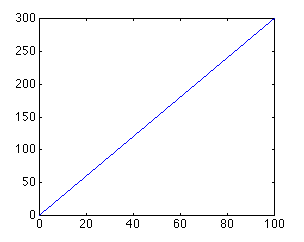
If we wanted to plot the simple, linear formula:
y=3x
We could create a m-file with the following lines of
code:
     x = 0:0.1:100;
     y = 3*x;
     plot(x,y)
which will generate the following plot,
One thing to keep in mind when using the plot command is that the vectors x and y must be the same length. The other dimension can vary. Matlab can plot a 1 x n vector versus a n x 1 vector, or a 1 x n vector versus a 2 x n matrix (you will get two lines), as long as n is the same for both vectors.
The plot command can also be used with just one input vector. In that case the vector columns are plotted versus their indices (the vector 1:1:n will be used for the horizontal axis). If the input vector contains complex numbers, Matlab plots the real part of each element (on the x-axis) versus the imaginary part (on the y-axis).
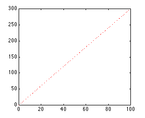
The color and point marker can be changed on a plot by adding a third parameter (in single quotes) to the plot command. For example, to plot the above function as a red, dotted line, the m-file should be changed to:
     x = 0:0.1:100;
     y = 3*x;
     plot(x,y,'r:')
The plot now looks like:
The third input consists of one to three characters which specify a color and/or a point marker type. The list of colors and point markers is as follows:
     y     yellow        .     point
     m     magenta       o     circle
     c     cyan          x     x-mark
     r     red           +     plus
     g     green         -     solid
     b     blue          *     star
     w     white         :     dotted
     k     black         -.    dashdot
  	                     --    dashed
You can
plot
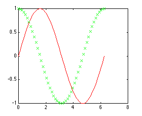
more than one function on the same figure. Let's say you want to plot a
sine
wave and cosine wave on the same set of axes, using a different color and
point marker for each. The following m-file could be used to do this:
     x = linspace(0,2*pi,50);
     y = sin(x);
     z = cos(x);
     plot(x,y,'r', x,z,'gx')
You will get the following plot of a sine wave and cosine wave, with the
sine wave in a solid red line and the cosine wave in a green line made up
of x's:
By adding more sets of parameters to plot, you can plot as many different functions on the same figure as you want. When plotting many things on the same graph it is useful to differentiate the different functions based on color and point marker. This same effect can also be achieved using the hold on and hold off commands. The same plot shown above could be generated using the following m-file:
     x = linspace(0,2*pi,50);
     y = sin(x);
     plot(x,y,'r')
     z = cos(x);
     hold on
     plot(x,z,'gx')
     hold off
Always remember that if you use the hold on command, all plots
from
then on will be generated on one set of axes, without erasing the previous
plot, until the hold off command is issued.More than one plot can be put on the same figure using the subplot command. The subplot command allows you to separate the figure into as many plots as desired, and put them all in one figure. To use this command, the following line of code is entered into the Matlab command window or an m-file:
subplot(m,n,p)
This command splits the figure into a matrix of m rows and n columns,
thereby creating m*n plots on one figure. The p'th plot is selected as
the currently active plot. For instance, suppose you want to see a sine
wave, cosine wave, and tangent wave plotted on the same figure, but not on
the same axis. The following m-file will accomplish this:
     x = linspace(0,2*pi,50);
     y = sin(x);
     z = cos(x);
     w = tan(x);

     subplot(2,2,1)
     plot(x,y)
     subplot(2,2,2)
     plot(x,z)
     subplot(2,2,3)
     plot(x,w)
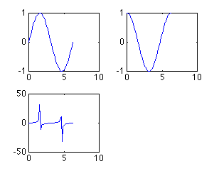
As you can see, there are only three plots, even though I created a 2 x 2 matrix of 4 subplots. I did this to show that you do not have to fill all of the subplots you have created, but Matlab will leave a spot for every position in the matrix. I could have easily made another plot using the line subplot(2,2,4) command. The subplots are arranged in the same manner as you would read a book. The first subplot is in the top left corner, the next is to its right. When all the columns in that row are filled, the left-most column on the next row down is filled (all of this assuming you fill your subplots in order i.e. 1, 2, 3,..).
One thing to note about the subplot command is that every plot command issued later will place the plot in whichever subplot position was last used, erasing the plot that was previously in it. For example, in the m-file above, if a plot command was issued later in the m-file, it would be plotted in the third position in the subplot, erasing the tangent plot. To solve this problem, the figure should be cleared (using clf), or a new figure should be specified (using figure).
Now that you have found different ways to plot functions, you can customize your plots to meet your needs. The most important way to do this is with the axis command. The axis command changes the axis of the plot shown, so only the part of the axis that is desirable is displayed. The axis command is used by entering the following command right after the plot command (or any command that has a plot as an output):
axis([xmin, xmax, ymin, ymax])
For instance, suppose want to look at a plot of the function
y=exp(5t)-1. If you enter the following into Matlab
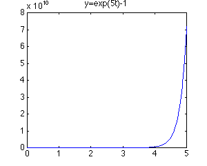
As you can see, the plot goes to infinity. Looking at the y-axis (scale: 8e10), it is apparent that not much can be seen from this plot. To get a better idea of what is going on in this plot, let's look at the first second of this function. Enter the following command into the Matlab command window.
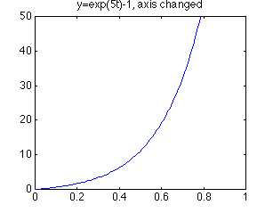
Now this plot is much more useful. You can see more clearly what is going on as the function moves toward infinity. You can customize the axis to your needs. When using the subplot command, the axis can be changed for each subplot by issuing an axis command before the next subplot command. There are more uses of the axis command which you can see if you type help axis in the Matlab command window.
Another thing that may be important for your plots is labeling. You can give your plot a title (with the title command), x-axis label (with the xlabel command), y-axis label (with the ylabel command), and put text on the actual plot. All of the above commands are issued after the actual plot command has been issued.
A title will be placed, centered, above the plot with the command: title('title string'). The x-axis label is issued with the following command: xlabel('x-axis string'). The y-axis label is issued with the following command: ylabel('y-axis string').
Furthermore, text can be put on the plot itself in one of two ways: the text command and the gtext command. The first command involves knowing the coordinates of where you want the text string. The command is text(xcor,ycor,'textstring'). To use the other command, you do not need to know the exact coordinates. The command is gtext('textstring'), and then you just move the cross-hair to the desired location with the mouse, and click on the position you want the text placed.
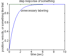
To further demonstrate labeling, take the step response plot from above. Assuming that you have already changed the axis, copying the following lines of text after the axis command will put all the labels on the plot:
     title('step response of something')
     xlabel('time (sec)')
     ylabel('position, velocity, or something like that')
     gtext('unnecessary labeling')
The text "unnecessary labeling" was placed right above the
position, I clicked on. The plot should look like the following:
Other commands that can be used with the plot command are:
Of course this is not a complete account of plotting with Matlab, but it should give you a nice start.
8/29/96 JDP