Map Drawing Lab. 2: Choropleth map
Introduction:
This lab will use the outline map you just made to create a choropleth map. We will use the data set provided at the bottom of this page to create a shaded map, in which variations in shading reflect variations in the values being mapped.
STEP 1:
1. Open the previous map, and save it with a new name (so you still have the original file).
2. Look at the table of values at the bottom of this page. There is a value for each of the areas you have drawn (or most - sometimes a data set has missing values). You might want to print it. Pay attention to the units of measurement, if there are any.
STEP 2:
Some data sets have lots of values. We don't want to have too many different shades of grey (or of one colour) on the map, as it is difficult to tell them apart. Four or five is enough. So we have to group the values into just 4 or 5 classes, using one of the methods explained below.
Classification:
Draw a 'number line' on paper: a line with equally spaced ticks like
the x-axis of a graph. Label it so that the ticks span the range of
your data set. Mark on it the positions corresponding to your actual
values. Look at the pattern:
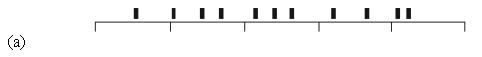
(a) If your plot shows a fairly even distribution, split the data
into classes with either equal ranges of values (0-10, 10-20, 20-30,
and so on), or approximately equal numbers of values in each class
(e.g. for 15 values, divide into 5 classes of 3 each, choosing breaks
between classes that fall between the 3rd and 4th value along the
line, then between the 6th and 7th and so on). For 15 values and 4
classes, one class would have to have only 3 values - that's not a
problem.
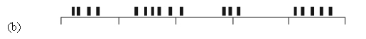
(b) If your plot shows several clusters with spaces between them,
split at values between the clusters. If there are only a couple of
clusters, you can split each into higher and lower values at the
average value or mid-point of each cluster to make more classes.
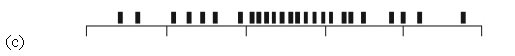
(c) If your plot is concentrated towards the centre, find the mean
(the average value) of the data set. Split into 4 or 5 classes
symmetrically about the mean. For example, with a mean value of 175
and extreme values of 50 and 350:
4 classes:
0 - 125,
125 - 175,
175 - 225,
225 - 350
The mean, 175, is used as a class boundary. 125 and 225 are
symmetrical (equally spaced) about 175.
5 classes:
0 - 100,
100 - 150,
150 - 200,
200 - 250,
250 - 350
The mean, 175, is in the middle of a class. Centres of other classes
are either arbitrary (but make them symmetrical) or put at 1 or 2 Standard Deviations from the mean (if you feel like doing that sort of calculation).
STEP 3:
Design a sequence of 4 or 5 shades of grey to represent those values.
Use only grey shades. Black is too dark for the darkest shade (you can't
see the country outlines between them), and white is NOT good for the
brightest shade because the background is white. Keep the tonal
steps between greys roughly equal (i.e. not one very light grey and
three barely distinguishable dark greys).
You can use a VERY
pale grey for water areas if you like, as long as it's not confused with the
lightest shade in a country.
STEP 4:
Add those shades to the map by shading your polygons (Figure 21). Refer to an atlas if you
are not sure which region is which.
STEP 5:
Design a legend, a set of boxes containing the patterns you have
selected. Label it carefully. This should include, a little
separated from the rest, a designation for 'missing data' if required.
(In some terms it is NOT required).
Missing values are a problem. They must be indicated somehow, but not in an ambiguous way. If water areas are white, missing values can not be, for instance. The best solution is to make missing values look very different from real values. Choices could include:
In a colour map, values are shades of one colour, missing values are a different colour.
Values are shades of grey or a colour, but missing values are given a distinctive pattern (if pattern libraries are installed).
Areas without values are given a distinctive outline but no shading. For instance, shaded areas get a thin black outline, but 'no data' areas get a thick grey outline.
STEP 6:
Add an appropriate title, source statement, and any other items you
wish to complete the design. Remember that a good title is specific
about the place, date and subject of the data. It answers the
questions WHAT, WHERE and WHEN. See the map design lecture notes. Use a sub-title if necessary to make your meaning clear.
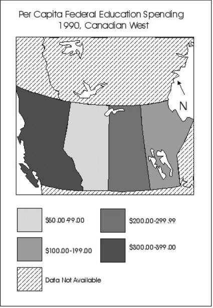
Figure 1. Example of a choropleth map.
Add appropriate labels and
source statement before submitting. This example is not intended to be an
illustration of the best in map design! Look at examples in atlases,
textbooks etc. to see professional examples.
Data for this term's lab:
The data below will be used for both drawing labs 2 and 3.
We will map the following data set in this lab:
Data: Current population and household estimates for Ottawa wards, at the end of 2015
Source:
http://ottawa.ca/en/city-hall/get-know-your-city/statistics-and-economic-profile/statistics/current-population-and
Note the following: The data tables we will use were compiled by the City of Ottawa. "These city-derived estimates are based on the 2001 post-censal [after the census] estimate of population and net new units from issued building permits, changes in rental vacancy and the decline on the persons per unit in existing households." In other words, they are estimates, starting with 2001 figures and projecting how they have probably changed up to the end of 2015.
Your map belongs to you, but the data, the information you use, belongs to the City of Ottawa. That means you have to give the city a proper reference like this:
"Data: City of Ottawa, retrieved January 2017." That statement MUST appear on your map.
The link goes to a page of information about households and population. A household is a house or apartment occupied by 1 or more people. There are always more people than households. Go down to the bottom half of the web page to find the data collected by ward (NOT sub-areas, the top half of the page). You can map population numbers in each ward, or household numbers for each ward, or if you like, population divided by number of households (that tells you how many people per household and might distinguish between larger families in suburbs and singles or couples in downtown apartments or condos). Choose any one of thjose three datasets to map. Make sure you know which ward is which on the map.
Be sure to make a map title that explains what you are mapping, especially the subject and the date. Also, you need a legend to explain the shading scheme. It should have a heading explaining what the numbers are.
NOTES:
If you can't tell which area is which in some cases, check it! There's no excuse for making a mistake with this - you can look at any other website or source that will help.
The numbers need NOT be included on the map itself, though they can be if you like, and choropleth maps sometimes include a table of the actual values IF there is room. Names are not necessary, but are OK if you want to include them. Areas not in the table (if any - it varies term by term) should be shaded differently and called 'no data'.
Assessment:
Follow the basic routine outlined in the three steps above. You are more likely to pass, and your mark in the final portfolio will be better if these conditions are met:
(1) No spelling mistakes!!! (2) An attractive, unambiguous and logical shading scheme, and good handling of missing values if necessary. (3) A good title, legend labels etc.
You have 2 weeks to do this assignment. Hand it in to your TA in the lab indicated on the schedule.