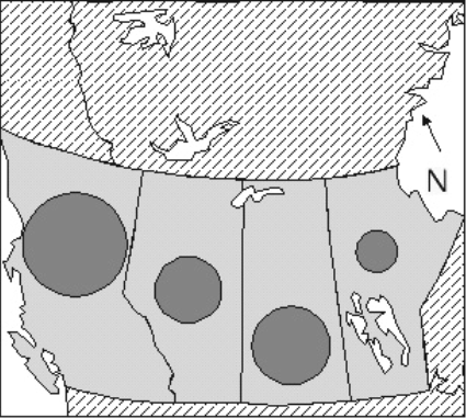
Figure 1. Proportional circle map - the AREA of each circle is proportional to a value in a data set. Other shapes (square, triangle, picture of something) can be used. They can be subdivided.
Read the section below on different types of proportional symbol, and how to calculate symbol sizes for each type. Then choose one of them and calculate the sizes. Do it on paper with a calculator or in a spreadsheet.
(1) Area proportional symbols such as circles (Figure 1) or squares, placed inside the boundaries of the regions your values refer to (or connected to those regions with 'leader lines' if the symbol is too large to fit inside). The AREA of each symbol is proportional to the value represented.
Figure 1. Proportional circle map - the AREA of each circle is
proportional to a value in a data set. Other shapes (square, triangle,
picture of something) can be used. They can be subdivided.
(2) Columns (Figure 2), with their bases inside the regions represented by the data. The HEIGHT of each column is proportional to the value.
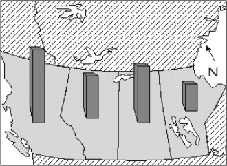
Figure 2. Column Map. The height of each column is proportional
to a value in the data set. Columns can be plain rectangles or drawn like
this. They can be subdivided.
(3) Flow lines, whose WIDTHS are proportional to the values (Figure 3). Used for any kind of movement - migration, trade, tourism, water flow. Suitable data sets are not provided every term.
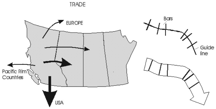
Figure 3. Flow map and diagram of flow arrow construction.
(4) Prisms (Figure 4), made by raising each mapped region vertically to give the appearance of a 3-dimensional block or prism. The HEIGHT of each prism is proportional to the value.
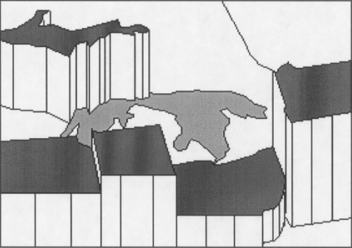
Figure 4. Prism map. The height of each prism is proportional
to a value in a data set. The tops can be unshaded or uniformly shaded, or shaded as in a choropleth map; the sides can be shaded to suggest a 3-D shape
- lots of room for variation. Look at published examples in atlases in the Map Library for ideas.
These were all described in lectures. For more inspiration, look through
modern atlases, textbooks or newsmagazines.
Choose a maximum size of symbol, in whatever units your units are set to (e.g. 1 inch or 2.5 cm high for highest column, 2 cm
diameter for largest circle). (Edit - Preferences - Units to set them to any units you want to work in).
Values were grouped into a few classes in the last lab. Do
NOT do that here - treat each value independently.
1) Make a list of the values, and find the square roots of those values.
Then work from the square roots list instead of the original list.
2) Choose a maximum symbol size - for example, a circle with 2 cm diameter.
The largest symbol represents the largest value - let's say the largest value in the square root list is 4500.
3) Now you go through the whole list of values, from the square root list. For each value, we get a symbol size where:
symbol size = (maximum symbol size) x (value / maximum value)
so for a value of 1450 we get:
symbol size = 2 cm x (1450/4500)
symbol size = 0.644 cm
4) Draw the symbol for that shape. It doesn't matter if you use this size as the diameter of a circle, the side of a square, the side of a triangle, or the height of a picture of a leaf or a house. They will all be in the proper proportion.
Select a circle from the drawing tool menu (an ellipse: make it into an exact circle by pressing the SHIFT key on the keyboard while you drag to the size you want). Adjust its size to make it fit your calculations (about 0.64 cm across in this example), and move it to the correct place on the map.
5) Create three or four extra symbols for round numbers near the bottom, middle and top of your range of values for a legend. For example, if the original values range from 122,500 to 20,250,000 (giving square roots ranging from 350 to 4500), you might use values of 200,000, 5,000,000 and 20,000,000 in your legend.
Remember to use their square roots to calculate symbol sizes for the legend, but label them with the ORIGINAL values!
Before you begin planning a column or prism map, make sure high columns or prisms in the foreground will not hide lower values behind. A very rough sketch of what your map might look like will help!
Rotate the base map so the highest values occur near the top or either edge of the map. You can rotate by grouping all the polygons in the base map into one unit, rotating that and then ungrouping so you can work on them individually.
Optional: Tilt the map (or at least give the appearance of tilting) by selecting everything in the map, grouping, then compressing SLIGHTLY in the vertical direction (this must be AFTER any rotation you want to do). To compress in the vertical direction, after grouping all base map elements, drag one of the top 'handles' downwards. Compress to 60-80 % of the original height - don't overdo it. Then ungroup and you can work on this modified base map.
Select a maximum symbol size (= height for column or prism maps, e.g. 4 cm, or width for flow maps, e.g. 1.5 cm). Find the largest value in your data set. Now for each of the other values:
size of symbol = (maximum symbol size) x (value / maximum value)
COLUMN MAP
Create a long skinny rectangle one dot spacing wide (or whatever you prefer, but always the same width). Adjust the height to fit your calculations, comparing it with the grid. Move it to the desired location. If you want to experiment with designs that look like 3-D blocks you can, but it's not essential.
Duplicate the first symbol as often as needed and vary the height for each symbol in turn. Remember the columns should all have the SAME WIDTH. Only the height varies.
Complete your map design with a title and a VERTICAL SCALE: a scale bar which shows what the heights of the columns mean. A horizontal scale is probably not necessary, but can be added if you wish.
FLOW MAP
Draw a 'guide line' along the route of each flow line (Figure 24a). Use the linear symbol calculation method (above) to find the width of each line. For any one line, make a bar of the correct width using the ruler as a guide. Duplicate this bar as often as necessary. Move copies of the bar to positions along the 'guide line' and rotate them to be perpendicular to the guide line. Draw a polygon which connects all the outer ends of the bars, ending with an arrow if necessary to show the direction of flow. Repeat for each line. Then delete the bars and the guide line.
PRISM MAP
This type of map is very striking but is more challenging to draw. See the enclosed illustrations. First consider the direction of view - it must be such that low blocks are not hidden by higher ones in front of them (see note on rotation and tilting above). Each region (polygon) in the map will become a prism, a block with a top, a bottom and vertical sides. Using Figure 5, follow these steps carefully for each prism in turn, working from the back to the front of the map:
(i) calculate its height using the linear symbol method.
(ii) draw a vertical line that long using the grid as a guide.
(iii) move that line so its bottom end is touching part of the boundary of the appropriate region on the base map (near a sharp corner or easily recognizable point).
(iv) use Copy and Paste under the Edit menu to create a copy of the boundary of the region (NOTE: polygons in the base map MUST be ungrouped for this step to work, if you grouped them for a rotation). The new polygon will be the top of the prism. The old one will be the bottom.
(v) move the new polygon up to the top of the vertical line.
(vi) reshape the bottom polygon to hide the back part of the base of the prism (it will be hidden by the opaque vertical sides). The upper part of the base can be made to exactly duplicate the lower edge of the top polygon or just moved upwards into the second polygon and then moved backwards to be hidden behind the top. Either way it cannot be seen.
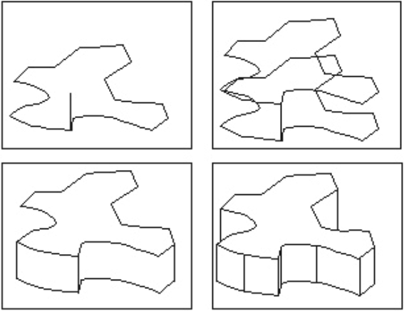
Figure 5. Top Left: base of polygon with a guide line drawn to
show height of prism. Top Right: Base of polygon duplicated and moved to
top of guide line. Bottom Left: Base is redrawn to form front side of
prism. Bottom Right: Extra guide lines are added to complete the 3-D effect.
(vii) duplicate the vertical line as often as necessary and move to link corners of the prism, to create the 3-D effect. Conceal parts of other interlocking blocks which should be hidden.
If the map is hard to recognize after rotation and manipulation,
add a north arrow (parallel to a north-south line on the map. HINT: If
you add it to the map before rotating and tilting, it will finish in the
correct orientation. Then you can move it to a good position.) Add a vertical
scale, title etc. to complete the map.
2. When you add the symbols, you can make them stand out against the background by being darker in shade or colour, or by drawing them with thicker lines, or both. You calculated sizes - now you just make a circle, square or whatever your symbol will be at each of those sizes and move it to the right place. Shade them all the same - the size is what carries the value information.
3. Modify your title if necessary. (It might not be necessary.)
4. If you put placenames on your choropleth map, the symbols may now get in the way. Take the names off if they give a cluttered look.
1. If you didn't do this before, calculate sizes for three symbols, exactly as you did above. Use as symbol values three round numbers near the top , middle and bottom of the full range of values.
2. Draw those symbols and place them in the map. We saw examples of legend design in several lectures. They might be side by side or 'nested' over each other.
3. Now add any text you need to explain what these symbols represent.
4. Shade or colour the map, making sure the symbols and the base map are distinct.
6. Add any finishing touches that will make the map look clean, attractive and informative.
Follow the basic routine outlined above. Your mark will be better if these conditions are met: (1) No spelling mistakes!!! (2) All text must be legible and its meaning must be clear and unambiguous. (3) Adjust your shading (or colour) to give the best looking result. (4) Make the symbols stand out against the background.
You have two weeks to do this assignment. Hand it in to your TA in the lab after two weeks. If you have some spare time, you can always use it to improve the base map drawing. :)