Map Drawing Lab. 4: Contour drawing exercise (2)
Introduction:
This second part of the contour map lab is intended to finish the drawing. You will add shading and labels, and a legend to explain the shading. Remember to use an appropriate title - it's not just "Australia" any more.
STEP 1:
Design a shading scheme to distinguish areas of different elevation. You need about 4 grey shades - you don't have to change shade between every contour line, it can be every second (etc.) line depending on the specific map. Select the
levels at which you will change shades. For example: shade areas
with values below a specific number darker, areas above lighter.
If in any doubt, look at contour maps in the Map Library or an atlas
to see how this sort of thing is handled. Keep your shading scheme
logical - move from dark to light as you rise in value.
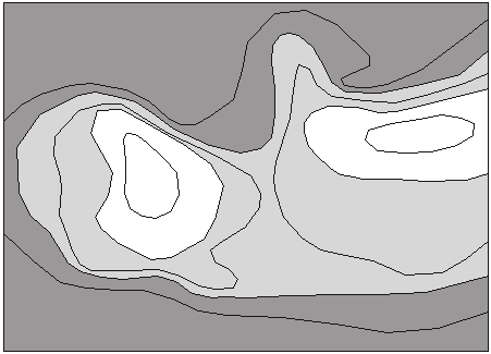
Figure 5. The number layer is deleted and the polygons are shaded.
You don't need a different shade for every contour interval. If some
lines are too jagged you can add extra points to smooth them.
The important design choice is the selection of distinct shades of
grey that will not overpower the map (obviously black is NOT suitable
as it will conceal any contours and labels within it). The darkest
shade must still allow text to be read. It is possible to turn text
white.
STEP 2:
Label the contours, keeping the labels very small
(about 8 or 9 point). Be legible, unambiguous, and never leave a
contour line without a label (unless you have chosen to label
alternate lines in steep areas). See the example in Figure 7.
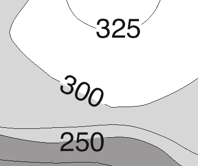
Figure 6. Add labels (greatly enlarged here). Keep them parallel to the contours. Note
how the line behind the label is hidden (in this case with a short line
segment wider than the contour and the same colour as the background).
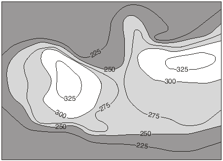
Figure 7. Shaded contour map. Now you can add the labels, a
legend to explain shading, a scale etc.
STEP 3:
In a NEW LAYER, make a legend: four boxes in a vertical or horizontal strip outside
the map, with appropriate labels to explain your shading scheme. As
you go from high to low in actual elevation you should go from high
to low or left to right on the legend (logical design again).
In this case, the height legend can replace a component of the earlier lab: a symbol legend if you had one, or the location map.
Don't forget to change the map title to explain what this new map is about, if you did not do it last week.
Now you can delete the point data image, if it is not deleted already.
STEP 4:
OPTIONAL!
4a) If the dataset is NOT topography:
you had a map of the region from Drawing Lab 1. It is hidden by the shaded contours. We can superimpose it over the contours just by changing the order of the layers. But now shading in the older map hides the contours! But select all the polygons in that older map layer and make them 'empty' (the red diagonal stripe symbol in the colour menu). Now the contours are seen through the base map. If the two sets of lines are too much alike make the base map lines thinner and the contours thicker. You may want to remove rivers or roads (if there are any in this term's assignment) if they complicate the new map too much.
4b) If the dataset IS topography:
Topography is different because the sea coast IS a contour. Here the base map goes behind the contour drawing. Fill in all land one shade, all water another shade, as part of your shading scheme. Add other shading as appropriate for higher or lower areas marked by your contours. PROBLEM: now the country boundaries show up only as far as the first shaded contour, but are hidden above that level. To avoid this, make a copy of the base map drawing layer (lock all other layers, do 'edit-select all' in the base map layer, group it, copy it, paste it in the new layer, line it up perfectly) and paste it into a new layer above the map.
Don't change your location map, if you have one.
Youb should delete all or most of the placenames from the original map, if not done already.
When everything is finished, save your file and print it.
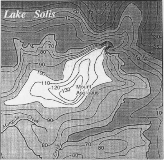
Figure 8. Part of a finished contour map with labels. Note how
lines are blocked out behind labels for greater legibility. Contours
in the lake show water depth.
STEP 7:
An option: DO NOT TRY THIS UNLESS YOU HAVE SOME SPARE TIME AND FEEL
LIKE A NEW CHALLENGE!
It is possible to convert your map to an
'illuminated contour' map like the example below (Figure 9).
Draw the contours as described above, at the specified intervals.
Add no labels or placenames at all. Make all contour polygons the
same shade of grey (or water all one shade, land all another shade,
if appropriate for this term's lab). Then make the contours
"illuminated": you will have to trace over every contour again, but
do it with thick lines (about 2 in the thickness scale). Imagine a
light source off to the left or upper left, shining on a model of the
terrain. All the contours on slopes that face the light are drawn as
white lines, all the rest are black lines. This means that a single
contour line looping around a hill will be half white (facing the
light) and half black (facing away from the light). The coastline
should be shaded like this as well (if there is one in this term's
map). The rivers, roads or other features (if there are any) could
be left out, or retained to help show locations. If they are retained,
convert them to very thin lines so they don't overpower the contours.
No legend is needed except to distinguish between water and land IF
both are in the map and you shaded them differently.
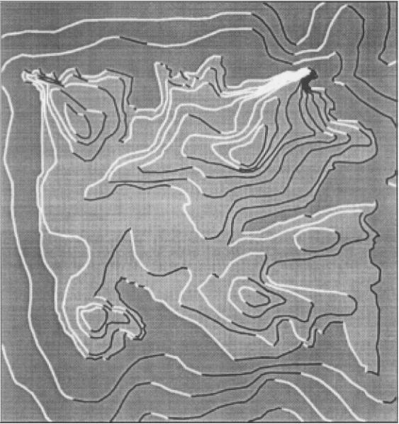
Figure 9. Illuminated contour map example
Assessment:
Follow the basic routine outlined above. Your mark will be better if these conditions are met:
(1) No spelling mistakes!!! (2) All labels must be legible, so be sure
they show up well and lines are hidden behind them.
Don't be fooled by labels which are easy to read on a greatly enlarged
image on the screen, but are too small on paper. The paper copy is
the one we mark! (3) Keep your shading scheme logical and evenly separated in shade from level to level. The darkest shade must not be too dark. If your map is in colour, use shades of one colour, NOT multiple colours.
You have this week and half of next week to do this assignment. Hand it in to your TA or instructor's office by Wednesday at 4:00 of the second week.