Lab One: Graphs, Histograms, Choropleth Maps, and Euclidean Distance
Introduction
This lab presents some of the most commonly used techniques for summarizing large data sets so that the researcher can visualize basic patterns within the data and make concise generalizations about their characteristics.
Graph: A graph is a diagram (as a series of one or more points, lines, curves, or areas) that represents the changes in a variable when compared to one or more other variables.Histogram: A histogram is a bar graph. It is used to show the distribution of values in a set of data. Often the data are grouped into classes (a category of values such as 0-9 years of age, 30-39 cm of rainfall, or $50,000-54,999 annual income). The bar of each class represents the number of cases in that class. This technique is very useful for identifying the number of occurrences of a class in a data set (frequency), and the distribution from the highest to lowest values in the data set (frequency distribution).
Histograms and bar graphs look very similar but they're different.
Histograms can be thought of as "sorting bins." You have one variable, and you sort data by this variable by placing them into "bins." Then you count how many pieces of data are in each bin. The height of the rectangle you draw on top of each bin is proportional to the number of pieces in that bin.
In bar graphs you have several measurements of different items, and you compare them. The main question a histogram answers is: "How many measurements are there in each of the classes of measurements?" The main question a bar graph answers is: "What is the measurement for each item?"
Choropleth Map: A choropleth map displays geographic data using shades of tone or colors to represent regional values of a data set. Euclidean Distance: Distances measured on the Earth's surface using Euclid's idea that the Earth can be measured using a series of straight and parallel lines and angles, thus treating the Earth as a flat plane rather than a sphere. u>
Computational Formulae:
a. Straight Line Distance for the calculation of the distance between two points termed A(x1 , y1) and B(x2 , y2) is:DAB = [ (x1 - x2)² + (y1 - y2)² ]½ ,
where x and y are physical distances.
b. Windy Road Distance for the calculation of the distance between two points termed A(x1 , y1) and B(x2 , y2)
separated by a non-linear transportation corridor: DAB = [
*x1 - x2*p + *y1 - y2*p ]1/pin which p = a specified power, such as 1.2, which typifies a super highway, or .8, which is a windy road.
c. Great circle distance: Since the earth is not flat the curvature of the earth becomes an important consideration
when large distances are calculated. In these cases one should use the
Haversine Formula
(from R.W. Sinnott, "Virtues of the Haversine",
Sky and Telescope, vol. 68, no. 2, 1984, p. 159):
dlon = lon2 - lon1
dlat = lat2 - lat1
a = (sin(dlat/2))^2 + cos(lat1) * cos(lat2) * (sin(dlon/2))^2
c = 2 * arcsin(min(1,sqrt(a)))
d = R * c
where lon2 is the longitude of the second point, lon1 is the longitude of the first point
lat2 is the latitude of the second point and lat1 is the latitude of the first point
This formula will give mathematically and computationally
exact results. The
intermediate result c is the great circle distance in radians. The
great circle distance d will be in the same units as R. For further
discussion see
http://www.census.gov/cgi-bin/geo/gisfaq?Q5.1
Mode: The most frequently occurring observation in the data set.
Median: The middle observation of a ranked data set.
Mean: x= Ex/n
where x is an individual observation; E is the sum of every individual observation; and n is the total number of observations in the data set.)Range: The highest observation in the data set minus the lowest observation.
Variance:
F2= E(x-x)2/nStandard Deviation:
F = the square root of the variance
GRAPHING:
Introduction
A graph displays information as a diagram of one variable as it changes relative to other variables. Typically, graphs have two axes: the X axis on the horizontal and the Y axis on the vertical. The Y axis best represents the independent variable whose value changes according to the value of X.
Graphs are a tool used to visualize data to discern patterns within the data that one might not readily see by just looking at a series of numbers. As such, these tools need to be calibrated properly so that you, the observer, can recognize and understand the information being presented. The axes act as rulers, marking equal intervals into which the data may be placed for visualization. The proper labeling of the axes is important, for without titles, units, numbers, and legends, the graph is not easily understood.
HISTOGRAMS:Introduction
Put very simply, histograms are visual representations of data or bar graphs using only one variable. Histograms take data, and rather than placing the data in a graph as a series of points, places the data into categories for analysis of frequencies and distributions. Histograms are also graphs, and as such they follow the same principles about axes and labeling as do regular graphs. Because histograms are different - they display data in groups, how the groups are defined is important. There are no "natural classes" in nature, so any grouping must be defined by the person using the data. One of the simple rules of thumb for determining the number of groups to be displayed in a histogram is: there should be no more than 5 times the log of the number of observations { 5(log10 n) } where n is the number of observations in the data set. Too few groups will hide interesting details; and too many groups defeats the purpose of grouping data in the first place. The intervals between the groups should always be the same, e.g., groups of ten, twenty, thousands, etc. Each group should be independent of the other groups i.e., no values in the groups are the same. To determine the interval for your groups, take the range (defined above) and divide it by the number of groups. Try to make intervals which are easy to work with and understand e.g., 10s, 20s, 100s, 1000s, rather than intervals defined by the (range/groups) values which may create odd numbers like 821.3 .
An important part of grouping data is to determine the frequencies of the groups. Frequency has already been defined above (the number of occurrences in the group), but cumulative frequencies are somewhat different. Cumulative frequencies show the number of observations in the data that do not exceed a certain value.PART I (40 marks)
Instructions: All questions in Part I are to be answered using the following data sets. Remember to follow the rules of graphing and of histograms to complete the questions below.| DATASET #1: Marks Distribution by Age for Geography 999B. | |||||||
| Age | Grade | Age | Grade | Age | Grade | Age | Grade |
| 19 | 94 | 20 | 85 | 22 | 61 | 19 | 80 |
| 22 | 76 | 21 | 58 | 19 | 81 | 34 | 81 |
| 22 | 70 | 19 | 75 | 20 | 56 | 21 | 68 |
| 19 | 55 | 19 | 70 | 38 | 64 | 18 | 72 |
| 45 | 77 | 24 | 76 | 19 | 73 | 24 | 78 |
| 23 | 82 | 28 | 78 | 24 | 73 | 30 | 76 |
| 23 | 63 | 20 | 75 | 23 | 61 | 19 | 72 |
| 19 | 74 | 20 | 72 | 20 | 68 | 22 | 72 |
| 20 | 86 | 19 | 63 | 21 | 84 | 20 | 78 |
| 19 | 76 | 33 | 68 | 19 | 74 | 25 | 72 |
| DATASET #2: Number of Patrons by Distance to London Galleria Mall (kms) | |||||||
| Distance | Patrons | Distance | Patrons | Distance | Patrons | Distance | Patrons |
| 0.25 | 18425 | 2.75 | 4700 | 5.25 | 2700 | 7.75 | 1700 |
| 0.50 | 12650 | 3.00 | 4300 | 5.50 | 2550 | 8.00 | 1620 |
| 0.75 | 9125 | 3.25 | 4000 | 5.75 | 2400 | 8.25 | 1550 |
| 1.00 | 7850 | 3.50 | 3750 | 6.00 | 2300 | 8.50 | 1500 |
| 1.25 | 6950 | 3.75 | 3600 | 6.25 | 2200 | 8.75 | 1430 |
| 1.50 | 6250 | 4.00 | 3450 | 6.50 | 2150 | 9.00 | 1380 |
| 1.75 | 5750 | 4.25 | 3400 | 6.75 | 2075 | 9.25 | 1300 |
| 2.00 | 5400 | 4.50 | 3250 | 7.00 | 2005 | 9.50 | 1200 |
| 2.25 | 5150 | 4.75 | 3100 | 7.25 | 1900 | 9.75 | 1150 |
| 2.50 | 4950 | 5.00 | 2950 | 7.50 | 1780 | 10.00 | 1000 |
Questions:
1) Draw graphs for the two data sets, and plot the data as points on the graphs (i.e., do NOT connect the points).
2) The graphs show two very different patterns. Describe the difference between the two graphs. Does the graph from data set 2 resemble any geographic pattern? Explain. USE DATA SET #1 FOR THE FOLLOWING:
3) Draw a histogram showing the frequency counts of the "grade" data from data set 1. Remember to follow the guidelines above, and establish an appropriate number of groups. Prepare a table showing your groups, their frequencies, and the cumulative frequencies.
4) Label on the histogram where the mean, mode, and first standard deviate (plus and minus the mean) are located. How many of the data observations are within one standard deviation?
5) Explain the importance of why groups should be independent of each other. Why are classes not defined as 40-50, 50-60, 60-70?
6) What effect can changing the size of the classes have on interpretation of histograms?
CHOROPLETH MAPS:
Introduction
Choropleth maps display spatial (geographic) data in shades of one color, or in various colors to represent data.
Rather than using a graph with X and Y axes to plot your data, choropleth maps allow you to visualize your data on a map of the region from where the data were taken. These maps have the distinct advantage over graphs in that the user gets to see differences in the data as they change from state to state, province to province, or country to country. As with all techniques, certain rules apply. For choropleth maps, the choice of tones or colors is very important. For example, take a look at any USA Today weather map. The hot areas are in warm colors such as yellows, oranges and reds. Cool areas are colored in blues and violets. Would it not be confusing if the colors were randomly chosen for each temperature level? You, too, must choose tones and colors carefully so that the viewer of your choropleth map can easily tell what the changes are in the data, even before that person reads the legend. When given a data set, the 5 times the natural log rule {5(log10 n) where n is the number of observations in the data set} applies to determine the number of groups, and the size of each group (see PART I in Histograms for a refresher).
EUCLIDEAN DISTANCE:
Introduction
Distances measured on the Earth's surface using Euclid's idea that the Earth can be measured using a series of straight and parallel lines and angles, thus treating the Earth as a flat plane rather than a sphere. When the Earth is treated as a flat surface rather than a sphere, all the places on earth can be given X and Y co-ordinates, just as if they were part of a graph - each place a point on the graph. So how then does one calculate the distance between points on a graph? The distance between the points is determined using a variation of Pythagoras' theorem a2 = b2 + c2. The calculation is given in the Formulae and Definition section above. Simply, Euclidean distance is determined by taking two points, let's call them i and j. I and j have X and Y co-ordinates because they are part of a graph (a flat plane). Take the point furthest to the right (j) (the highest X value) and subtract from it the X value of the other point (i) (the one to the left). Take that value and square it. The calculation you have just done is the first part of the distance equation from above. For the next half of the equation, take the Y value for the highest point (the one furthest from the X axis) and subtract from it the lower Y value (the one closest to the X axis). Take that value and square it. Now you have both parts of the distance equation. Add these two values together. Take the square root of this sum. NOW, you have the distance between the points i and j!
PART II (40 marks)
Instructions: All questions in Part II are to be answered with the data sets provided below. This section can be completed with the use of a computer for the questions related to Euclidean Distances. Try to complete the calculations manually.Questions:
|
DATA: Question 7: Number of Establishments per State. |
|||
|
Alabama |
86537 |
Montana |
25028 |
|
Alaska |
14773 |
Nebraska |
43749 |
|
Arizona |
86469 |
Nevada |
29932 |
|
Arkansas |
53409 |
New Hampshire |
33249 |
|
California |
745686 |
New Jersey |
214076 |
|
Colorado |
98826 |
New Mexico |
35700 |
|
Connecticut |
92816 |
New York |
463762 |
|
Delaware |
18781 |
North Carolina |
165076 |
|
Florida |
361330 |
North Dakota |
18979 |
|
Georgia |
157667 |
Ohio |
248694 |
|
Hawaii |
29313 |
Oklahoma |
74663 |
|
Idaho |
26513 |
Oregon |
81077 |
|
Illinois |
272738 |
Pennsylvania |
279595 |
|
Indiana |
128311 |
Rhode Island |
27726 |
|
Iowa |
73130 |
South Carolina |
79743 |
|
Kansas |
65858 |
South Dakota |
20492 |
|
Kentucky |
79006 |
Tennessee |
113292 |
|
Louisiana |
88290 |
Texas |
394482 |
|
Maine |
34840 |
Utah |
26585 |
|
Maryland |
114874 |
Vermont |
19639 |
|
Massachusetts |
158329 |
Virginia |
149695 |
|
Michigan |
210303 |
Washington |
131919 |
|
Minnesota |
112167 |
West Virginia |
37687 |
|
Mississippi |
52888 |
Wisconsin |
122142 |
|
Missouri |
130284 |
Wyoming |
14630 |
| Source: Bureau of the Census (1993), County Business Patterns 1990, U.S. Dept. of Commerce | |||
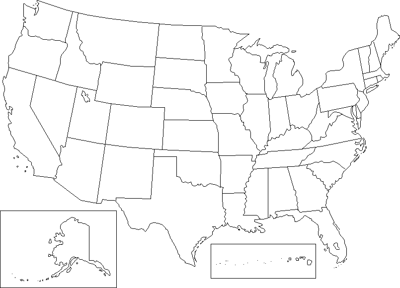
7) Draw a choropleth map for the above data following the rules of groups and colors/tones.
| Euclidean Co-ordinates for Selected Canadian Cities | |||
| point | City | x | y |
| 1 | Victoria | 0 | 28 |
| 2 | Vancouver | 2 | 30 |
| 3 | Whitehorse | 3 | 67 |
| 4 | Yellowknife | 28 | 58 |
| 5 | Edmonton | 21 | 35 |
| 6 | Calgary | 18 | 28 |
| 7 | Saskatoon | 31 | 28 |
| 8 | Regina | 34 | 23 |
| 9 | Thompson | 46 | 36 |
| 10 | Winnipeg | 46 | 20 |
8) Graph the data points using the X and Y co-ordinates provided above. Calculate the Euclidean distances from point 1 to 2, 2 to 3, 3 to 4 etc. for the entire data set. You may wish to present your answers in a table.
9) Euclidean distances are good measures over short distances and over flat, even terrain. Explain what some of the short-comings of Euclidean distance are, and how they affect measures of distance.
10) For each of the following city pairs, you are asked to compute, by hand, the Straight Line, and Windy Road distances that separate them. Remember to show all of your work!!! All of the necessary information that will enable you to calculate these distances is provided as follows:
First Set: Straight line distance, London to Victoria is 3170km due West, and 620km due North.
Windy Road = .8.
Second Set: Straight line distance, St. John's to Valdez is 5220km due West, and 1495km due North.
Windy Road = .75.
Third Set: Straight line distance, L.A. to London, UK is 8475km due East, and 1955km due North.Windy Road = .85.
Part III (20 marks)
Now its time to do some work using your own data. The reality of data analysis is often more complex and difficult than it appears in class examples or laboratory exercises. It is important that you get a feel for what is involved in real life situations. Therefore, go and collect some data applicable to your area of interest in geography. The data should be such that it can be graphed as a histogram or a map or both. If you want to get some extra credit (see below) be sure you data has locational information (coordinates).
For this data, you should explain where it comes from, what are the likely sources of error, and its significance to geographic study. Then graphically analyze your data and explain what you find.
Extra credit: (10 marks) Present a hypothesis where the location of your data points is important. Explain how the distances between the locations are or are not of importance.
You may want to try the link below for more information about histograms
http://davidmlane.com/hyperstat/desc_univ.html