Layers & file compression
Today we will be looking in more detail at how to manipulate layers, and how to compress files.
Before we get started, I want to show you the same files, manipulated a number of ways. Here are the pieces that we will use, so I would like you to download these to your images folder:
 (3 k) -- saved as a 256-color gif
 (4 k) -- saved as a "max" jpg
Using these files, we will try a number of manipulations. Before we do anything, open up PhotoShop and open the gif file [called gif-sketch.gif] you've just downloaded.
File..>Save As..> and save as a Photoshop (psd) file.
Notes to go over this lesson later, if you wish.
First of all, we will add the word, "directions", using the text tool. You will notice that it comes in its own layer.
 (3k) -- here's what it will look at if we save the file as a 256-color
gif.
Why optimize?
I'll now take you through optimizing or "compressing" this file in a number of different ways, but before we do that, let's look at some of the differences in compressions of gif files:
 |
 |
2.63 k |
1.87 k |
 |
 |
| 1.13 k 9 web-safe colors, no dithering |
0.866 k 4 perceptual colors, no dithering |
 |
 |
| 1.51 k 16 web colors, dithering, with a matte |
16 web colors, dithering, with a matte (on the same colored background) |
Do these little differences matter? Well, they can
add up. For example, the 4-color gif looks okay, and is less than
1k, the 128-color is 2.63 k, which will be read as 3 k. That's a
difference of 2 k. If I have seven buttons, that's 14 k, which will
take about 6 seconds to download. You try different compressions
to see what you like.
Optimizing
To optimize, go to file..>save for web..>
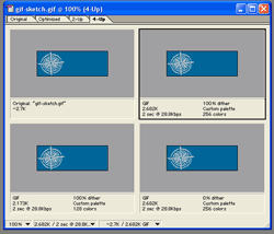
First make sure that you have all four tabs showing in your document window. It will look something like this:

Then use the pre-set choices at the top of the optimize palette to try different optimizations. If you want to see what an optimization looks like in a browser, you can preview using the button in the bottom right corner.
Finally, when you have the optimization you want, click the save button.
Using a photograph
Now we will go through and add the other image (the photograph as a compass in a new layer) and play with manipulating it.
First of all, go to:
File..>Open..> and open the large jpg file called "gif-com-pic.jpg"
Now, use the rectangular marquee tool to draw a box around the whole image. Copy it (ctrl-c).
Now click on your photoshop file with the other line art compass, and paste the photographic compass in (ctrl-v). It should cover up the line art, and the word "direction". Move the direction layer above the layer you've just added by clicking and dragging it up in the layers palette, like I showed you in class.
Let's save this version.
Because the compass is a photograph, you'd think it should be saved as a jpg, but this is one of those circumstances where hybrid art has to be tested. As it turns out, it works just as well as a perceptual gif, and it is a bit smaller:
 "medium" jpg (1.56 k)
 gif (1.4 k)
In this case, you can really see the difference.
