
Web Typography
Scalable fonts
Our starting point is to think about our audience, and to follow the golden rule. We want our audience members to be able to use their browsers howerver they want, so we need to allow for them to change their type settings. This means we should use scalable or elastic measures for our type (by %, ems or rems).
What's an em?
Traditionally, an em is a sliding measure of the letter "m", in whatever the type is set at. So, if you've set your bodytype at 12 pt, an em is 12 pt. As designers we can set an em to be whatever we want, but if you don't want to mess with your audience's browsers (we don't), then we leave the body type at 100%, which means an em will be whatever your audience member has set their default typeface to be. If they haven't changed their defaults, it will probably by 16px.
Clear as mud, right?
Essentially, though, you can set everything after your body type in ems, and all your type will scale the same, no matter what your users are doing with their browsers. The problem with ems is they take on the attributes of their parents, so you can get nested values. So say you've set your body to be 1.2 em (19.2px), if you then made an h1 tag to be 2 ems, your heading would be 38.4 px. Things get hard to calculate quickly.
A better solution: rems
Get around that parent/child problem by using a rem measurement, which is a root em. This means that all rem measurements are based on the root HTML element, which we can set in pixels or percentages.
For example:
html {font-size:100%;}
This would set the default font size to 100% of whatever your audience member's browser is set to. (Usually 16px.)
So if you then decided to create a h1 rule:
h1 {font-size: 3rem;}
That would mean the font size of an h1 tag would be 3x16px, or 48px.
If you set your html tag to 62.5%:
html {font-size: 62.5%;}
That would make your body type 10px, which is a bit hard to read, but then it makes the math a bit easier for the rems.
- 1.5 rems = 15px
- 2 rems = 20px
- 3 rems = 30px
- and so on.
Terms
Body: the type for the main content areas of your page. We actually use the body for this.
Serif: small stroke at the terminal of a main stroke. AKA, fiddly bits.
Sans serif: a typeface without serifs.
Font: we use this pretty interchangeably with type now, but if you aim to be a true font nerd, then you'd know a font is a specific point size and weight of a typeface, for example, 12 pt Helvetica bold is a font. Helvetica is a typeface.
Leading: comes from the strips of lead that used to be placed between lines of type, and measures the distance from one baseline to the next. We don't have a leading setting in CSS, but we can achieve similar effects using the line-height setting. Some browsers add leading by default and others don't, and like paragraph tags and headers, it goes above and below each line of text.
A few general guidelines
Sans serif is (generally) easier to read
As we enter the embedded type era, I'm sure we'll start to see more easily-read serif fonts, but for now, the general rule is that san serif are a bit easier to read because of the resolution of the screen is not as good as that of paper. This is changing though. My Kindle is just as good resolution, for example.
Pick one typeface for your body and then add one for display
A lot of beginning designers make the mistake of using too many typefaces with their designs. I try to use sans serif for my body and then add a serif or something fun for headers. Don't go crazy when you're starting. Pick two fonts, and stick to them when you begin.
Left justify
Use ragged right or left-justified text. Fully justified text does not work with the version of CSS we're learning, because it does not allow for hyphenation, which is required to prevent justified text from having weird spacing issues. Right-justified and centered text is very difficult to read. and should only be used for design elements (right-justified) or for headers (centered).
Column width
The traditional sweet-spot for column width is 66 characters. Each em is roughly the width of two characters, so that means 33 ems is a nice measurement for column width. (If you're looking for a general rule for fixed (pixel-based) designs, shoot for 650px.) If you're doing a liquid layout, then you'll need to do some math at both ends of the display size (screen resolution.)
A single space after a period is best
I was taught to type by adding a two spaces after a period. This is a relic of 20th C. technology, and no longer required. In fact, I've heard it enrages some people to see an extra space.
Line height, not leading
We can't play with leading (yet) in CSS, so we have to use the line-height property to set the space between lines of text. Set your line heights proportionally too. Let's say you've made your html 62.5%, and set your body to be 15px. So if you want 15 px of space for your line height, you would set the line height to be 1:
body {font-size: 1.5rem; line-height:1;}
That would be a little tight. You can always make the line-height "normal", which is about a measure of 1.25:
body {font-size: 1.5rem; line-height:normal;}
These pages are set to a line-height of 1.6:
body {font-size: 1.5rem; line-height:1.6;}
Put an extra line between paragraphs, rather than indent
You can indent the first line of text using the text-indent feature (you'll find it in the "block" category), but it's actually easier to enable the scanning behaviour if your paragraphs have space between them.
Only use the blockquote for quotations
Don't be tempted to use the blockquote for spacing. That is what margins and padding are for. The blockquote should be used for pullquotes or quotes. Add some margin around the quote so it stands out too. (Also, blockquote is a semantic tag.)
Embedding Google Web Fonts
Up until recently, we've been stuck with using the resident typefaces that our users have on their computers. This has meant we've been stuck with a limited number of typefaces that we can depend on. You can supplement these with font stacks. (Check out this CSSfontstack.com for a great list.)
Now, with Google's open source web fonts, we have another option, which is to embed the font in our CSS or HTML. (Both are options)
Let's go to the Google site and pick two fonts -- a body type and a pair for our display or headers.
Choosing a Font
When you arrive, you can choose what fonts you want to browse. For this example, I've changed to just search for Roboto, and left the rest of the settings to the default.
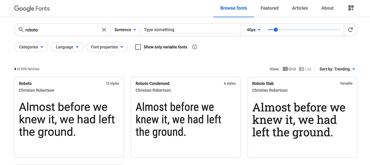
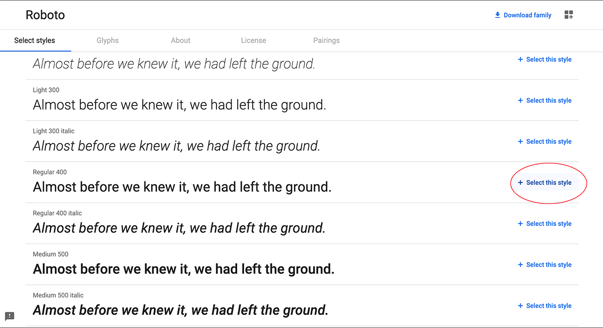
I'm going to pick the regular Roboto typeface. A slider will come out from the right, showing you've added this to your fonts.
Choosing a Pairing
Scroll down to the bottom of the page (or click the Pairings button) to see the sample of what the font looks like in a paragraph, and there you can also see some of the most popular "pairings" with the font.
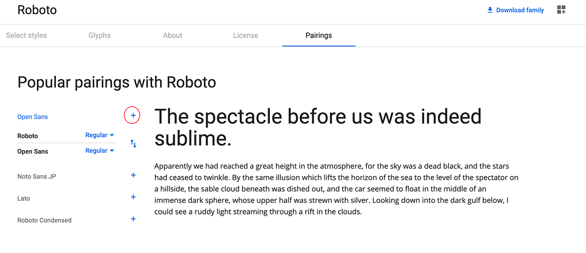
This sample is helpful for determining how readable the font is going to be. Make sure that you're looking at the correct fonts too. In this screenshot, Roboto is in the headline (display type), not the main text (body type). I decided to see what it looked like with Open Sans by clicking on that font's plus symbol. (Again, the slider will come out so you can see that you've added Open Sans to your list of fonts.)
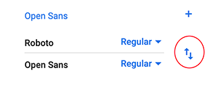
You can reverse which is the display and which is the body by clicking on the little up and down arrows on the right.
Click on the + symbol to add the display to your font choices. (Again, it will appear in the black bar on the right.)
Embedding the Code
Now, go back to the slider on the right, and click on the "embed" button.
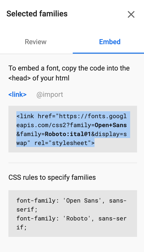
There's a few things to note here:
By default it will show you the embed code for when you have access to the HTML. We're going to copy the <link> tag, as I have shown above. (Highlight the code and then copy.)
That code gets pasted into the <head> part of your document. The best place to paste it is right in front of your <style></style> tags. (Not within the style tags, or it won't work.)
Now your HTML page has access to the fonts. You can add them to your CSS. Normally, we use the body selector to control for the default typeface. In this case it would be Roboto, and it would look like this:
body {font-family: 'Roboto', sans-serif;}
(Of course, you'll also add all the other default body type rules, such as font-size, color, etc.)
For the pairing, try doing a string of selectors for your headers. That will apply automatically in your HTML:
h1,h2,h3,h4,h5,h6 {font-family: 'Roboto Condensed', sans-serif;}
For these, you'll probably just use the font-family, because undoubtably, you'll want different sized headers. You may also want different colors, padding, etc.
Helpful links
Measurements in CSS (W3C Schools)